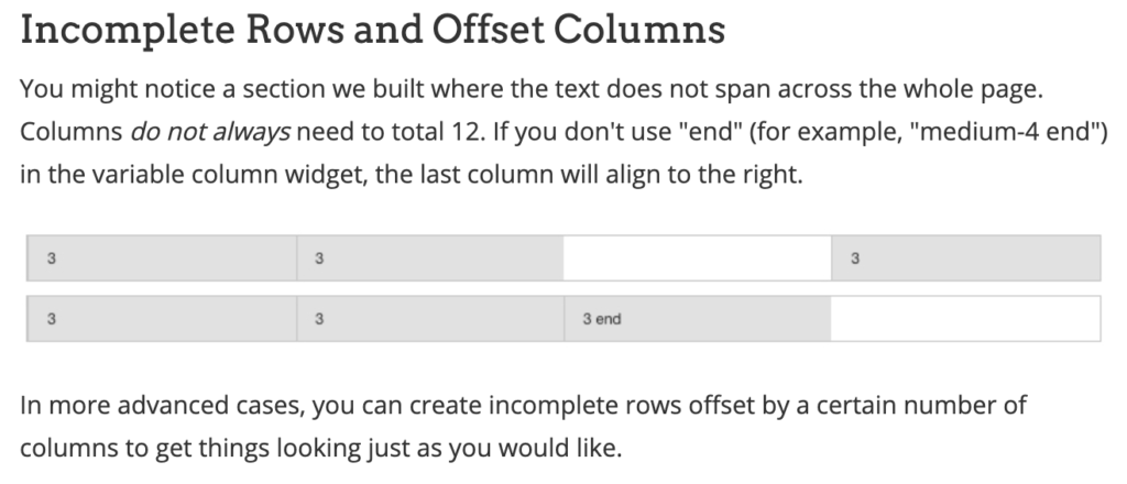
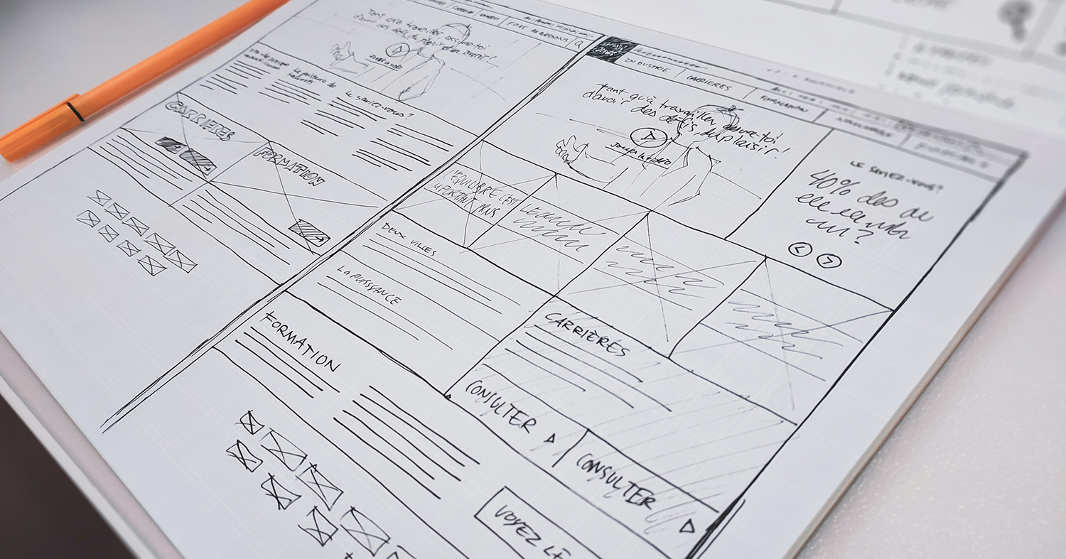
Every designer at some point learns about “the grid.” Grids are invaluable in organizing visual elements and creating conventions for presenting content. They are also vital in how web experiences translate across different viewports.
I have certainly heard a lot of people throw the term around, but it seems to be poorly defined. To a beginner, a grid might seem inflexible. When understood and used properly, however, a grid is liberating. It can hold elements in consistent, understandable relationships. A grid can allow freedom to adapt to the demands of presenting many types of content. It can keep the experience from falling apart or one section looking alien to another.
This is more than a visual nicety or a trick of design. It allows us to create a pleasing gestalt in presenting information. It can make an experience greater than the sum of its parts.
An impostor: a grid “system”
I think the lack of clarity regarding what a grid (and especially, The Grid) means in the field of web design leads to a lot of problems. I have found myself entangled in what might be described as an abusive relationship with a grid “system”. As I came to understand later, the issue I was having was not with the grid per se. Rather, our team only had a finite set of configurations of columns, complete with prescribed variations of arrangements on different breakpoints. This design apparently existed to “simplify” the authoring process by giving the author a limited number of options.
This “system” was global, so everything I touched as an experience designer on this project had to be constructed from these predetermined combinations. This system was my constant companion. Little by little, I realized how abusive this relationship was. At every turn, our team had to rework, rethink, and restructure pages. Work kept coming back and I felt stuck, all the while reminding our team that we had to use the style guide and select from the available “grid configurations.”
As with many abusive relationships, my initial impression of my companion — this grid “system” — turned out to be overly optimistic. When I first heard “grid” I thought, “oh good, we have a set of 12 columns that we can configure as needed. This was not the case. It turned out to be something much worse. This particular grid system was more like a grid’s evil twin.

Grid systems, like grids themselves, are not intrinsically good or bad. Simply having a “system” with “configurations” does not guarantee consistency or clarity. (Neither does having a “policy”, or a “style guide”, but those will have to wait for other discussions).
It is beyond the scope of this article to relate how truly awful this thing was. We’ll go spelunking into its dark recesses and why it was so ridiculous in another post.
For now, I want to relate something more hopeful: showing why designers and developers mistake a prohibitive “system” for the elegance and freedom of a grid, and how I convinced our team to break free of this system.
Let’s not confuse the two
As stated above, in this particular system, the developers gave us a finite set of grid configurations, specified by breakpoint, into which we were obligated to design. Fundamentally, this was a problem.
Any time no configuration could be found to present the content in the way we designed it, we either had to rethink our approach or attempt workarounds, which were very hacky and tough to translate clearly to our authors. Our XD team was pretty good at playing by the rules, and we did strive to match (and even map out) the grid configurations we used throughout our page designs. But the rigidity of the system meant that frequently we had to settle for less than optimal display at some breakpoints, and pepper our layouts with marginal notes explaining why and how we resorted to workarounds. The “system” forced us all to do a ton of work for sub-standard results. We had to play several ends against the middle, and this became damnably frustrating.
Literally the day I was introduced to this system, the first question I asked was: why are there arbitrary limits to the grid system? I was sure that pure grids use simple rules. If a grid is being portrayed as something complicated, it’s probably an imposter.
So, I asked our team: if I have 10 grid configurations, why wouldn’t the eleventh one be better for a certain application? If I had 100, why wouldn’t I need number 101? The rebuttal was that, useful as more configurations might be, documenting and describing 100 configurations takes a lot of work.
“OK,” I replied, “Instead, let’s just set a rule that we can use any configuration of 12 columns. Then we wouldn’t need to document any discrete instances at all. One simple rule, no artificial constraints.”
Beyond finite thinking
We had weekly meetings with all of the stakeholders involved in the ongoing project. We were all restricted to using the same platform, including the same grid system. When we next had an opportunity to introduce changes we wanted to see implemented, I knew what I had to do. I also knew I had to be ready for some resistance.
Any enhancements the team made in my time on the project were arduously slow, and new suggestions always met with lots of questions, which is common with large projects. But what I believe further complicated matters was the misconception that seemed to be driving a lot of this system: Everything must be rigidly defined in every particular.
This “finite” mindset was so entrenched that many team members seemed to see the entire design platform as a shipping container. All of the boxes were perfect cubes; each box divided into cubic compartments. Every element, therefore, had to be a cube. But when these cubes were all packed together, there was no breathing room. The final result showed it. Configurations stifled pages with uncomfortable, rigid presentation. All of the contours in the content that could have been preserved to add interest and help differentiate between types of content were blunted or chopped since they couldn’t be packed as cubes.
All I wanted was everything
At last, we had a chance to put in a request to change our grid system. Our team members were tired of searching through dozens of options only to find nothing useful for our designs. We already had a 12-column grid. Since the configurations were nothing but artificial restrictions, we reasoned that they just take the shackles off and use a true 12-column grid. Lovely, right? They took our request “under consideration” for later discussion.
Fast forward to a recent weekly meeting, where the Finite Thinking Monster was lurking. An agenda item came through requesting our XD team to submit our “list of new grid configurations”.
*Vinyl record scratch* Please, tell me this was not happening.
My supervisor was at another meeting, and I was the lone XD representative in the room, so I slammed on the brakes. I unmuted our phone line.
“Thanks for bringing this up. We don’t want a list of more configurations. Actually we don’t want any configurations. We just want to use the 12-column grid.”
Dead. Silence.
Redrawing the lines
I persisted, explaining that there were numerous instances where we were never able to do enough to workaround the poor options for display on certain breakpoints. I related that we simply needed a 12-column grid available at all three breakpoints. As long as we provided accurate layouts on a 12-column grid, it would be far easier to translate info to the authors. It would simplify things for everyone. By contrast, adding to the list of individual (finite) configurations would bloat the platform. It would also never solve the problem, exactly because a limited set is always missing something you can’t anticipate needing.
It would be easier for the web authors, too. Instead of having to scroll through a list of 50+ individual configurations which are hard to tell apart at a glance, this new approach would only require one 12-cell configurator for each breakpoint. It would be much easier to copy a number from 1-12 than search through a list of same-looking grey boxes.
It took a bit of prodding to get the group to warm to the idea. Fortunately, a UX lead from our partner agency on the other end of the phone finally chimed in with “yes, that would be the right way to do it.”
Support grew within the next few minutes. A quorum of interested stakeholders had agreed on the inclusion of an open grid on our platform.
Apart from backlog delays, adopting the full grid actually moved along with little resistance. We rolled it out with no further changes, and the team reveled in the freedom it offered. Our work improved, and we elminated delays due to confusing workarounds.
Thank goodness I didn’t miss that meeting. I wonder what would have happened if I’d been out sick that day. They might have given me twice as many useless “grid configurations” to sift through.
A grid we can (finally) agree on
It is surprising how many times I have encountered mistakes when using the 12-column grid. I finally decided to create my own cheat sheet and just share it with my team any time the idea of using grids comes up. Without fail, this approach to the grid heads off 90% of the confusion designers and developers seem to have about using the grid in web development projects.
That grid cheat sheet, along with dozens of other design tools are included in my book. You should definitely take a minute and read more about Building Better Sites. It will help you and your team at every stage of your process.


